
Black is the color that does not emit or reflect light in any part of the visible spectrum. It absorbs all frequencies of light. Choosing to use black as a base for identity and brand. As you may have observed, black goes well with almost every other color.
ref - https://onextrapixel.com/anatomy-of-colors-in-web-design-black-a-representation-of-style-mystery/
The dark UI feature was included in apps and web initially to reduce eye strain. Dark background also eliminates distracting white spaces on some webpages, thereby enhancing focus.
It also helps in limiting image distortion and Saving energy.
Highest light setting on devices consumes six times the amount of power as in the highest dark setting. Hence, the dark background consumes very less power.
ref: https://hackernoon.com/dark-ui-reasons-why-apps-are-using-this-mode-7q17y30kg
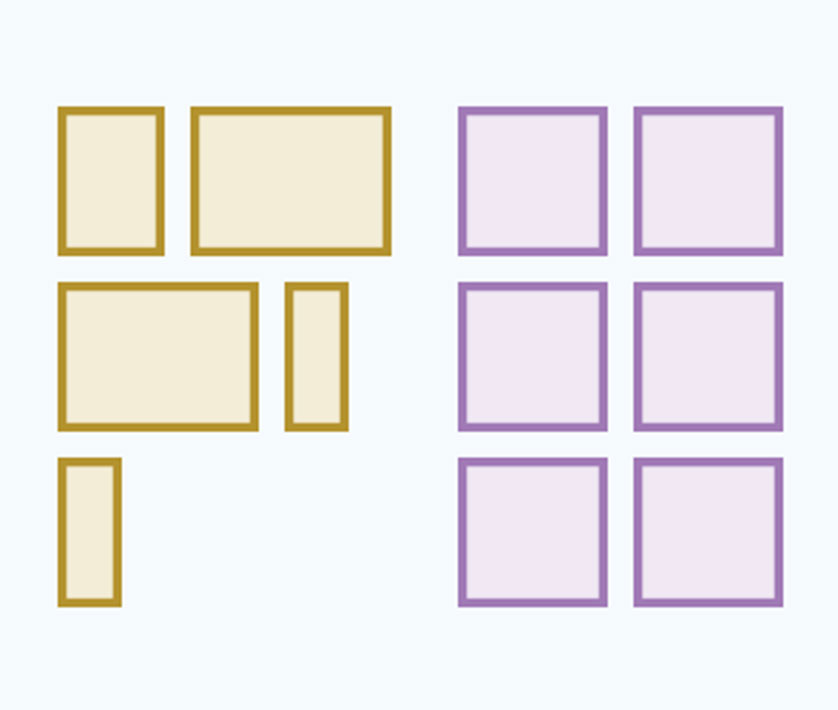
Take a look around the most well known apps on your phone or in your web browser, and you’ll find a nice little technique that is being utilized to keep the web clean and tidy. It’s the use of grey, and its really useful for User Interface designers like myself.
"So many leading brands are taking advantage of grey to make clean design more attainable in complex situations"
In an online world where we are bombarded by content and media of all kinds, most brands are becoming hyper-focussed on “clean design” for all their online user experiences. Clean design is typically characterized by solid colors and lots of breathing room between elements, and there’s one really big element that is often needed: white space. Oh that’s right, good o’l white space.
How can we get more whitespace while also organizing complex layers of information and interaction? That’s were grey comes in. It allows designers to reduce the prominence of inactive content, emphasis important or active content, and all while maintaining a squeeky clean user interface.
ref: https://medium.com/@nateamarose/great-looking-grey-in-user-interface-design-ca6c591df098
I focus on driving brand and product management and engagement for my clients via technology and design.
I combine spectacular design and audience-centred strategy to create and drive the most interactive and experiential.
I guarantee to yield and often times exceed the expected design & engagement for my clients and users.